


I stayed
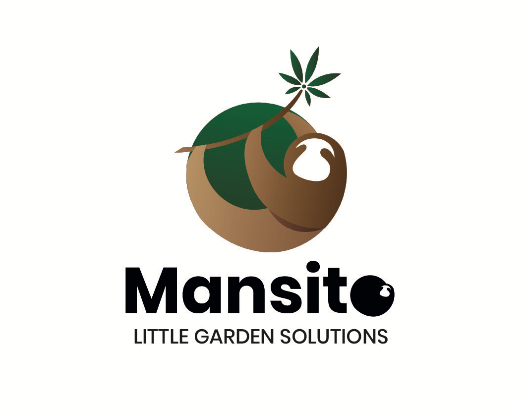
Mansito is the new graphic identity for the cannabis seed brand.
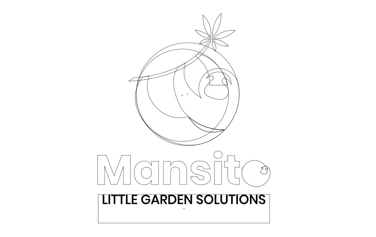
Playing with the brand name itself, we have sought to represent this animal in a more pictorial way as the brand logo. To do this, we have used the Golden Ratio as a base from the union of a series of circles. Thus designing a responsive logo adaptable to all the media and supports that the brand may need.
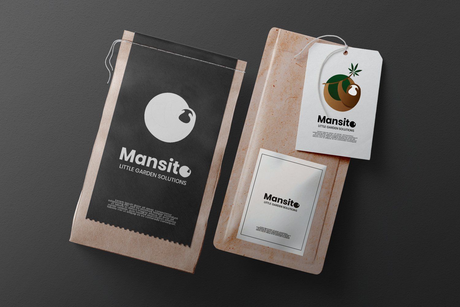
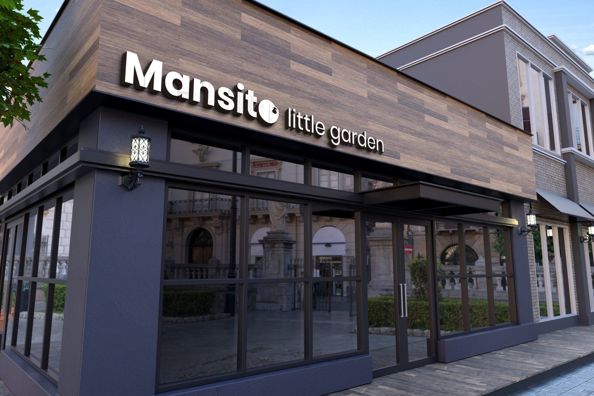
Simplicity and the use of natural colours that refer to the product for sale as well as the protagonist of the brand itself are sought at all times.